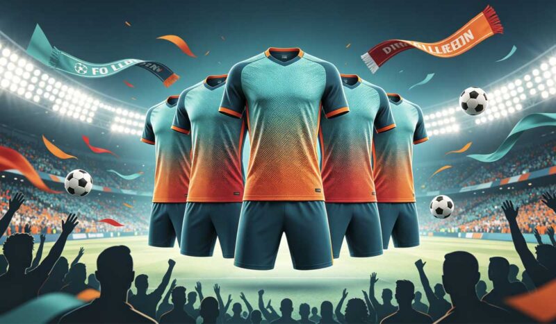
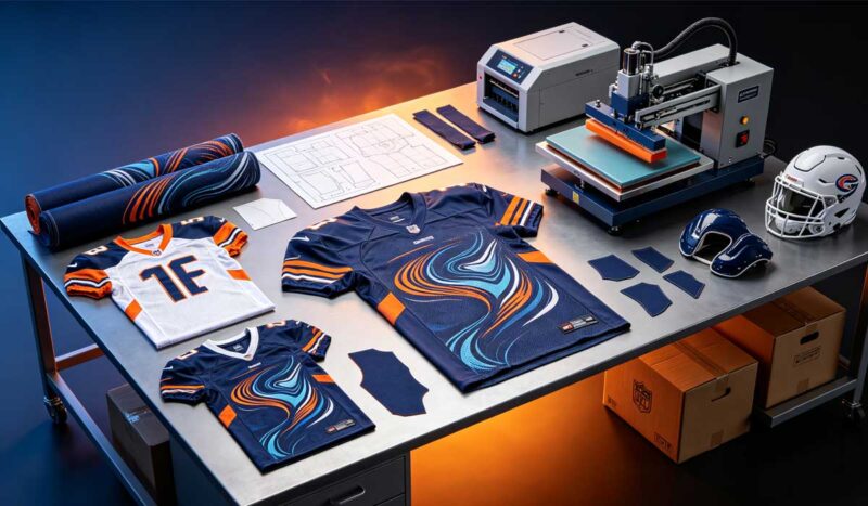
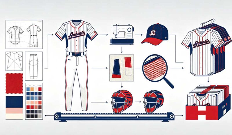
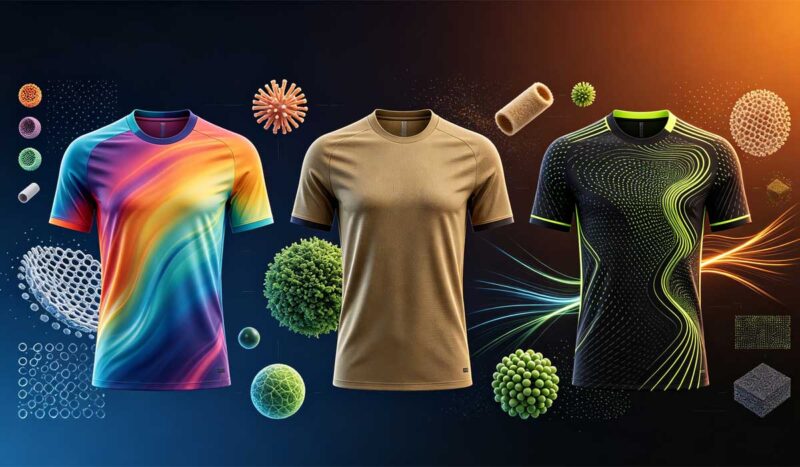
The 2026 FIFA World Cup was the largest football tournament ever staged: 48 national teams, 104 matches, three host countries, and a global audience measured in the billions. It was also, quietly, the most influential jersey design showcase in the history of the sport.
According to SGI Europe, the global football jersey market reached roughly $8.7 billion in 2026 and is growing at about 7.2 percent a year, with World Cup years producing the sharpest spikes in demand. Adidas dressed 14 of the 48 competing nations, Nike dressed 12, and Puma dressed 11 — together, three brands covered 77 percent of the tournament. Every one of those kits was debated, dissected, and imitated within days of release, because for the first time in World Cup history, digital platforms were projected to overtake linear television in total viewing.
Here is the part that matters if you run a club, a league, or an apparel brand: the design decisions made for those 48 kits are already flowing downstream. As a sportswear factory with 17+ years of OEM experience and a monthly capacity of over 100,000 jerseys, we see this pattern after every major tournament. Orders that arrive in our sampling room in the months after a World Cup look noticeably different from the orders that came before it. This cycle, the shift is bigger than usual.
Below are the five jersey design trends the 2026 World Cup put on the map, why each one works from a production standpoint, and how your team or brand can use them without a national-team budget.
Why This World Cup Changed Jersey Design More Than Previous Editions
Three forces collided in 2026 that had never aligned before.
First, scale. Expanding from 32 to 48 teams meant 16 more national kits, 16 more fan bases buying replica shirts, and a licensing footprint larger than any previous tournament. FIFA’s four-year commercial revenue for this cycle was projected at around $11 billion, up from roughly $7.5 billion in the Qatar 2022 cycle, and merchandise is a core driver of that growth.
Second, full-price demand. Retail tracking from LSEG and Centric Market Intelligence showed that neither Nike nor Adidas resorted to discounting World Cup merchandise, and limited-edition collaborations — Jacquemus x Nike Team France, Adidas Mexico x Someone Somewhere — sold out quickly. Nike’s World Cup apparel carried an average price of $125 against Adidas’s $95. Consumers proved they will pay a premium for a jersey that feels designed rather than decorated.
Third, the sublimation maturity curve. Full-body dye sublimation has been affordable for small orders for several years now, which means the visual language of elite kits — gradients, engineered patterns, all-over artwork — is no longer exclusive to federations with eight-figure supplier contracts. A youth club ordering 15 jerseys can now access the same design complexity as a national team.
That last point is the reason this article exists. The trends below are not fashion commentary. They are ordering instructions.
Trend 1: The Retro Revival — 1994 Came Back, and It Is Staying
The single most talked-about design direction of the tournament was nostalgia, and the United States set it off. The USMNT home kit leaned hard into the visual memory of 1994 — the last World Cup on American soil — with rippling wave stripes in red and white that referenced the denim-flag original without copying it.
Within weeks, club teams across North America were requesting wave and fluid-stripe patterns on their own custom kits. We saw the same requests land in our design inbox.
Why it works technically
Wave and fluid patterns are a near-perfect match for full-body sublimation:
- The pattern is printed into the polyester fibers at around 200°C, so a complex flowing stripe costs exactly the same to produce as a flat solid color. Complexity does not change the per-unit price in a sublimation program.
- Curved lines hide panel seams better than straight horizontal stripes, which makes the finished garment look more expensive.
- The design reads as intentional heritage rather than a generic template, which matters for club identity.
How to apply it
If your team wants the retro look, keep three rules:
- Anchor the pattern in your own history, not someone else’s. A wave stripe works because American fans connect it to 1994. Find your equivalent — a founding year, a classic kit, a local symbol — and abstract it.
- Keep the chest quiet. Let the wave flow across the shoulders, sleeves, and lower hem, but keep the number zone and crest area clean for readability.
- Pair dark bases with one bright contrast. Navy with white, deep green with gold, charcoal with red. Two colors, executed sharply, beat five colors executed loosely.
Retro is not a one-season gimmick this time. Anniversary seasons, throwback tournaments, and heritage nights give clubs a recurring reason to keep a retro-inflected kit in rotation — which is why we expect this trend to outlast the tournament cycle.
Trend 2: Gradients and Asymmetry — Sublimation Finally Grew Up
Flat color is losing to color that moves.
Across the 2026 tournament and the club orders that followed it, two design moves kept appearing together: gradient washes, where one tone bleeds into another across the full body of the shirt, and asymmetric layouts, where a diagonal stripe or graphic block crosses the torso instead of mirroring left and right.
Why it works technically
Five years ago, gradients were a production headache. Screen printing handles them poorly, and early digital printing banded badly on large color transitions. Modern rotary-press sublimation solved both problems:
- A properly calibrated press at 180–210°C with quality transfer paper reproduces smooth gradients at production speed, with no per-color setup cost.
- Because sublimation pricing is based on fabric and labor rather than color count, a 15-piece youth order with a full gradient costs the same per unit as a plain block-color kit. This is the single most under-appreciated pricing fact in custom sportswear.
- Asymmetric designs need correct pattern mapping — the diagonal should cross secondary zones like shoulders and side panels, not the front number area — but that is a design-file problem, not a cost problem.
How to apply it
- Put the light end of the gradient high. When the lighter tone lands at the shoulders and upper chest, it draws the eye upward and keeps player numbers legible from the stands and on camera.
- High-contrast gradients photograph better. Deep teal shifting to electric blue, or charcoal opening to light grey at the hem, reads clearly in match photos — and match photos are how clubs recruit players and sponsors on social media now.
- Neon accents on dark gradient bases — neon pink trim on deep teal, bright lime on charcoal — were the most-requested combination we saw this cycle, especially from travel clubs and youth programs.
If your current kit is a solid color with a logo, this is the lowest-risk upgrade available: same fabric, same fit, same price bracket, dramatically more visual identity.
Trend 3: Heritage and Cultural Storytelling Woven Into the Fabric
The most sophisticated design movement of 2026 had nothing to do with color. It was about meaning.
Instead of placing a crest on a blank template, national teams and clubs increasingly built their identity into the sublimation pattern itself — regional symbolism, cultural motifs, and city references rendered as repeating textile textures across the shirt. Mexico’s collaborations rooted in artisan craft, and the strong merchandise demand around culturally specific kits from Spain, Norway, and Brazil, showed how powerfully fans respond to a jersey that means something beyond its color scheme.
Why it works technically
Heritage patterns are a sublimation-native idea:
- Repeating motifs abstracted into textile patterns avoid the “costume” look. The reference should be felt more than seen.
- Full-panel sublimation carries fine line detail at 300 DPI artwork resolution, which is where cultural patterns live — woven textures, geometric repeats, topographic lines.
- Because the pattern sits inside the fabric rather than on top of it, it survives two to three full seasons of washing without cracking or peeling. A printed-on graphic telling a cultural story would be a liability; a sublimated one is an asset.
How to apply it
- Start with one symbol, not five. A city’s skyline silhouette, a regional weaving pattern, a club’s founding-year typography. One idea, repeated with discipline.
- Brief it as a background, not a feature. The motif should sit at 10–20 percent visual intensity behind the crest and numbers. If someone at arm’s length sees only a texture and someone up close sees the story, you got it right.
- Work with a manufacturer who asks about the story. If your supplier never asks why you chose a symbol, they will place it wrong. This is a design-conversation trend as much as a visual one.
For brands, this trend is a positioning gift. “Inspired by our city” is a story a $30 private-label tee cannot tell, but a sublimated jersey can tell at no extra production cost.
Trend 4: Recycled Polyester Crossed the Line From Option to Default
Every World Cup has a sustainability story, but 2026 is the year recycled fabric stopped being a marketing footnote and became a specification. Recycled polyester appeared across national-team kits as a standard material rather than a special edition, and certifications like GRS (Global Recycled Standard) and OEKO-TEX moved from the brand’s sustainability page into the buyer’s purchase order.
We feel this shift directly on the factory floor. Five years ago, perhaps one in twenty OEM inquiries mentioned fabric certification. Today, buyers from Europe and North America routinely ask for GRS transaction certificates and OEKO-TEX test reports before they ask about price.
Why it works technically
The honest technical picture, from a factory that runs both fabrics:
- Modern recycled polyester (rPET) at 150–160 GSM matches virgin polyester on the metrics that matter for match play: moisture-wicking rate, four-way stretch recovery, and color retention through repeated wash cycles.
- Sublimation behaves the same on rPET as on virgin fiber — the disperse dyes bond to the polymer chains identically, so print vibrancy and wash fastness (we test to a 4.0+ grade on ISO 105-C06 color-fastness-to-washing) are equivalent.
- The trade-offs are cost and hand-feel variation. rPET typically adds a modest premium per yard, and low-quality recycled stock can feel slightly harsher. This is why the certification matters: GRS verifies the recycled content, and OEKO-TEX Standard 100 verifies the absence of harmful substances. Both documents should be available for the specific fabric lot in your order, not as generic marketing PDFs.
How to apply it
- Ask for certification by name. “Eco-friendly fabric” is a claim. A GRS scope certificate plus a transaction certificate covering your order is proof.
- Market it where buyers actually look. For Amazon sellers and DTC brands, sustainability language in the listing, A+ content, and packaging insert converts better than a sustainability page nobody visits.
- Do not wait for regulation to force you. Extended producer responsibility and textile-labeling rules are tightening across the EU and several US states. Brands that build certified supply chains now will not be scrambling in 2027.
The broader point: Gen Z and Millennial buyers increasingly treat environmental standards as a purchase filter, not a preference. A recycled-polyester kit is no longer the virtuous choice. It is becoming the expected one.
Trend 5: Performance Construction Became Visible Design
The final trend is subtle but structural: the engineering of the jersey — where the mesh goes, how the fit is cut, how the finish feels — is now part of how the jersey looks.
Watch any 2026 match and you will see it: second-skin athletic fits, laser-cut or engineered mesh panels mapped to heat zones, matte-finish sublimation that reads premium on broadcast, and typography treated as a design element rather than an afterthought. Performance construction stopped hiding inside the garment and started showing on the surface.
Why it works technically
Three production details separate a 2026-standard jersey from a 2019-standard one:
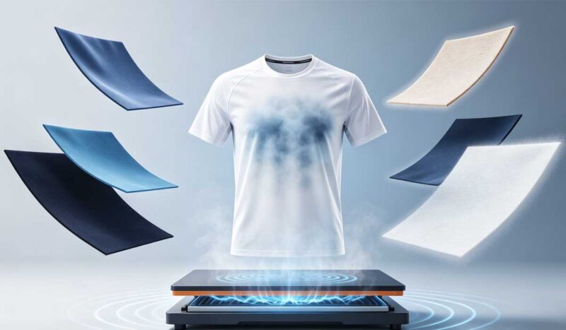
- Zoned ventilation. Instead of uniform fabric throughout, modern kits place bird-eye or pinhole mesh panels at the upper back, underarms, and side seams — the zones where heat maps show players dumping the most thermal load. On the production line, this means multi-fabric marker planning and more precise cutting, which is why it used to be reserved for top-tier programs. It no longer is.
- Fit architecture. The current athletic cut uses set-in or raglan sleeves with ergonomic shoulder construction, a slightly dropped back hem, and four-way stretch through the torso. The practical benefit buyers care about: fewer fit complaints across a 25-player roster, which means fewer size exchanges and happier sponsors.
- Matte and textured finishes. Tonal prints, embossed-look patterns, and matte sublimation finishes photograph better under stadium lighting and studio lights than high-sheen fabrics. As social media becomes the primary channel where kits are seen, camera behavior is becoming a design input.
How to apply it
- Specify zones, not just fabric. When you brief a manufacturer, do not ask for “breathable fabric.” Ask where the mesh panels are placed and why.
- Test the fit across your full size run. A cut that works in adult medium but breaks down in youth small or adult 3XL is a construction problem, not a sizing chart problem. Ask for a graded size sample before bulk production.
- Treat numbers and names as typography. Custom fonts, stylized numbering, and considered placement elevate a kit more cheaply than any other single change. Just keep legibility rules: block-based forms, strong contrast against the background zone, and minimum stroke widths that survive a 50-meter viewing distance.
What These Five Trends Mean for Your Next Order
Step back from the individual trends and a single strategic picture emerges.
The 2026 World Cup proved that design complexity, sustainable materials, and performance construction are no longer premium tiers — they are the baseline expectation that national teams set and everyone downstream inherits. Fans who watched 48 teams in engineered, story-driven, recycled-polyester kits will not be excited by a club shirt that looks like a colored T-shirt with a heat-pressed logo.
The good news is the economics. In a modern sublimation program:
- Design complexity (gradients, waves, heritage patterns) adds no per-unit cost
- Low MOQs — down to single pieces for sampling and small team runs — remove the inventory risk of trying a bolder design
- Recycled fabric adds cost but increasingly returns it in conversion rate and brand positioning
- Typical production timelines of two to four weeks mean a club can still get a 2027-season kit designed, sampled, and delivered without an eight-month runway
The brands and clubs that win the next cycle will be the ones that treat their jersey as their most visible marketing asset — because after this World Cup, that is exactly what it is.
How to Brief Your Manufacturer for a 2026-Standard Kit
Whether you are a club manager ordering 20 shirts or a brand planning a 5,000-piece retail run, the brief determines the outcome. Here is the checklist we wish every client used:
- Reference, not just description. Send two or three images of kits you like and mark what specifically you like about each — the gradient direction, the stripe spacing, the number font. “Something modern” is not a brief.
- Vector artwork. Logos and crests in AI, EPS, or high-resolution PDF. Raster logos pulled from a website header cannot survive 300 DPI sublimation printing.
- Color standards. Pantone references or physical swatches, never screen colors. A monitor’s “navy” and a fabric lot’s navy are two different colors until you anchor them.
- Fabric specification. GSM (140–160 for match jerseys), stretch direction, and any certification requirements — stated in writing.
- A physical sample before bulk. Always. Approve the fabric hand-feel, the print sharpness, the color accuracy, and the fit on a real body before production starts. Reputable factories expect this request; be cautious with any supplier who resists it.
- Timeline honesty. Share your actual deadline, including buffer. Production schedules flex for honest timelines and break for optimistic ones.
Frequently Asked Questions
What were the biggest jersey design trends at the 2026 World Cup?
Five trends defined the tournament: retro 1994-inspired wave patterns, gradient color flows with asymmetric layouts, cultural and heritage motifs sublimated into the fabric, recycled polyester as a standard material, and visible performance construction such as zoned mesh panels and athletic second-skin fits.
Do gradient or complex jersey designs cost more to produce?
Not with sublimation printing. Because dye sublimation prices are based on fabric and labor rather than color count or pattern complexity, a full-gradient, all-over-print jersey costs the same per unit as a plain solid-color kit. This holds even for small orders of 15–20 pieces.
Is recycled polyester good enough for competitive match play?
Yes. Certified recycled polyester at 150–160 GSM matches virgin polyester on moisture-wicking, stretch recovery, and color fastness through repeated washing. Sublimation print quality is identical because the dyes bond to the same polymer structure. The key is verifying GRS and OEKO-TEX documentation for the specific fabric lot in your order.
How long does custom jersey production take after the World Cup design cycle?
For most OEM manufacturers, sampling takes about one week and bulk production takes two to four weeks depending on order size and decoration complexity. Clubs planning for a spring or fall 2027 season should start the design conversation at least eight weeks before they need delivery.
Can a small club with 15–20 players get national-team-style designs?
Yes. Full-body sublimation has no meaningful minimum for design complexity, and many factories — including ours — accept MOQs as low as one piece for sampling and small runs for team orders. The design tools available to a national federation and a Sunday-league club are now effectively the same.
What is the difference between sublimation and screen printing for these 2026 design trends?
Sublimation infuses dye directly into polyester fibers, so gradients, waves, and heritage patterns become permanent parts of the fabric that never crack, peel, or fade. Screen printing lays ink on top of the fabric, handles gradients poorly, and adds per-color setup costs. Every one of the five trends in this article assumes sublimation.
How do I keep player numbers readable on a busy patterned jersey?
Keep the number zone visually quiet: let patterns flow through the shoulders, sleeves, and hem while the chest and upper back stay low-contrast. Use block-based fonts with strong stroke width, and place the lighter end of any gradient high on the shirt. A good manufacturer’s design team will map your pattern around the number zones during the proofing stage.
Will these World Cup jersey trends still matter for the 2027 season?
Yes. World Cup design influence historically runs in four-year cycles, and the 2026 edition set the baseline for what fans now consider a “real” kit. Retro storytelling, gradients, and certified sustainable fabrics are structural shifts in buyer expectation, not one-season fashion.
The Bottom Line
The 2026 World Cup compressed a decade of jersey evolution into one tournament. Retro waves proved that heritage sells. Gradients and asymmetry proved that sublimation removed the cost barrier to bold design. Cultural motifs proved that meaning beats decoration. Recycled polyester proved that sustainability is now a specification, not a slogan. And visible performance construction proved that engineering is part of aesthetics.
None of these trends require a federation budget. They require a clear brief, the right fabric, and a manufacturing partner who understands what this tournament changed.
At Jistar Sport, we have spent 17+ years producing custom soccer jerseys and team uniforms for clubs, brands, and retailers worldwide — from single-piece samples to 100,000-piece monthly runs, with free design support and full GRS and OEKO-TEX certified fabric options. If your team or brand is ready to build a kit that belongs in the post-2026 era, send us your design brief and we will return a free mockup and quote.