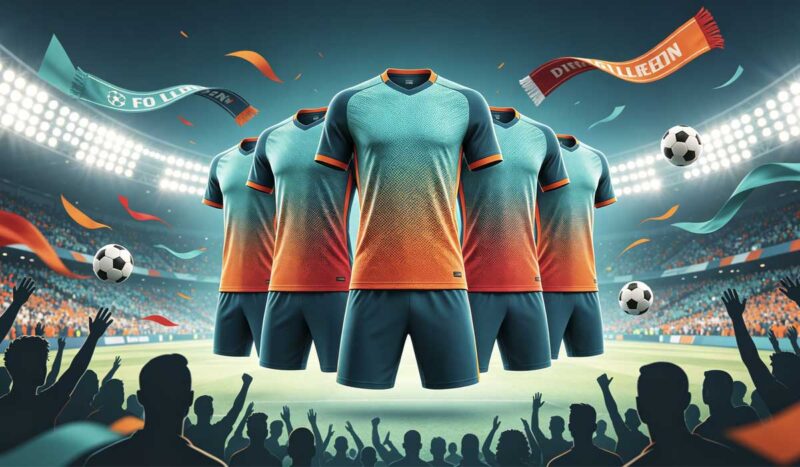
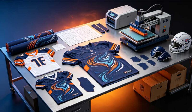
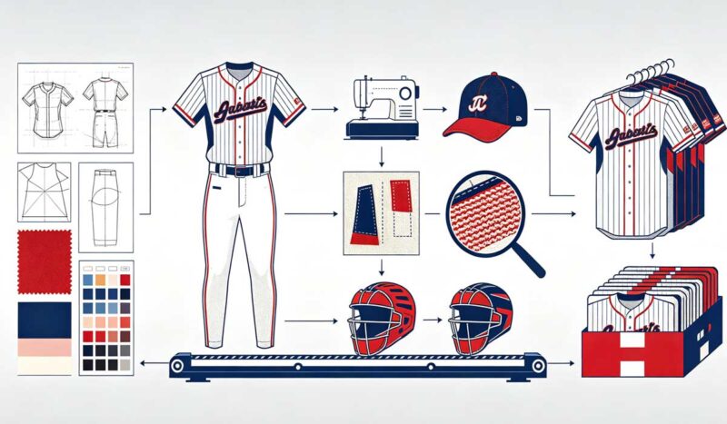
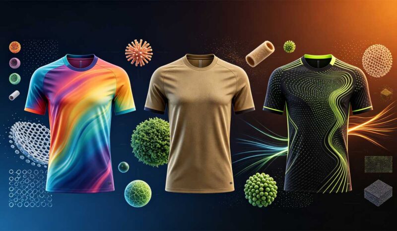
In April 2026 — two months before the World Cup kicked off — CNN ran a style story with a headline that said everything: the World Cup’s best shirts are already 30 years old. Timothée Chalamet had been photographed in a bright green Mexico ’94 shirt. Dua Lipa was wearing vintage Brazil. Adidas quietly put its trefoil logo, last seen on a World Cup shirt in 1990, onto 25 of its 2026 competition kits.
Then the tournament started, and the USMNT walked out in a home kit built on rippling red-and-white wave stripes — a direct descendant of the denim-flag jersey the United States wore the last time it hosted, in 1994. Within weeks, club teams across North America were requesting wave patterns on their own custom kits. We know, because a measurable share of those requests arrived in our design inbox.
As a factory with 17+ years of OEM sportswear production behind us, we have watched design cycles come and go. This one is different — it is not a fashion blip, it is a structural shift in who buys jerseys and why. This article breaks down why 1994 came back, what the design DNA of that era actually is, and how your team or brand can execute a retro soccer jersey design that looks intentional rather than costume-like.
Quick Answer: Why Did 1994-Style Jerseys Dominate 2026?
The short version for buyers:
The 2026 World Cup was hosted in North America — the same soil as 1994 — and the host nation’s wave-stripe kit made nostalgia the tournament’s visual theme. But the deeper driver is blokecore: the streetwear movement that made vintage football shirts everyday fashion. The soccer-jersey-as-streetwear market was valued at $2.81 billion in 2025 and is projected to exceed $5.2 billion by 2034. Retro is not a memory; it is the fastest-growing segment of the jersey business.
The rest of this article is the evidence, the design rules, and the production playbook.
The Evidence: This Is a Market Shift, Not a Mood
Four data points show how deep the retro wave runs.
1. Vintage buyers are no longer collectors. David Jones, co-founder of Cult Kits — one of the platforms that turned vintage shirt trading from flea markets into a global business — told CNN that 70 percent of his buyers purchase for nostalgia, “the players you pretended to be growing up,” while the remaining 30 percent have discovered soccer kits purely as fashion. Dedicated resale platforms like Classic Football Shirts, Cult Kits, and Saturdays Football have scaled a once-informal market into trusted global retail.
2. Gen Z feels nostalgia for an era it never lived in. Psychologist Clay Routledge calls it “historical nostalgia” — a documented longing for periods you never personally experienced — and his research found 68 percent of Gen Z adults report it. Cultural critic Simon Reynolds describes the broader condition as “Retromania”: 1994 and 2026 now exist on the same screen simultaneously. A teenager can spend a weekend inside France ’98 on YouTube and emerge emotionally attached to a shirt that was stitched before they were born.
3. The biggest brands rebuilt product lines around it. During the tournament, Travis Scott’s Cactus Jack and Nike launched a collection inspired by Nike’s early-2000s T90 line, priced from $52 to $168. Adidas Originals partnered with BAPE on jerseys explicitly referencing the USA 1994 and Japan 1998 squads. Adidas’s U.S. site now maintains a dedicated blokecore section built around Samba, Gazelle, and Campus retro sneakers. When the two largest sportswear companies on earth merchandise around an aesthetic, the aesthetic is the strategy.
4. The 2026 kits themselves encoded it. Beyond the USMNT waves: Germany’s shirt carried end-of-an-era collector energy, Mexico leaned into artisan heritage, and retro-inspired templates appeared across federations. CNN’s kit analysts now sort legendary shirts into “the crazy shirts, bold enough to seem wrong at first (USA 1994, Jamaica 1998, Mexico 1998), and the beautiful shirts, quietly perfect (Colombia 1990, Italy 1994)” — and 2026’s best-received designs borrowed from both columns.
Why 1994 Specifically? The Anatomy of the Era’s Design DNA
Nostalgia alone does not explain why one tournament year became the reference point. 1994 sits at a unique intersection in jersey history, and its design vocabulary is unusually specific.
It was the last World Cup of the maximalist print era. The early 1990s were the peak of what kit historians call the “crazy shirt” period — manufacturers experimenting with jacquard-woven club crests, tonal patterns, and graphics that covered the whole shirt. The USA’s denim-look wave flag, Nigeria’s electrifying green-white-green, and Mexico’s aztec-inflected green were all 1994. Within a few years, late-90s minimalism flattened everything. The boldness of ’94 reads as exotic precisely because the industry abandoned it.
It was pre-sponsor-saturation. Early-90s shirts carried little or no front sponsorship. To modern eyes drowning in advertising, a clean chest reads as luxury. This is why retro-style designs photograph so well on social media — nothing competes with the pattern.
The silhouette was different. Vintage shirts of the era ran boxy with thicker fabric and dropped shoulders. Brazilian vintage dealers report that it is exactly the boxy cut and heavier hand-feel of 90s and early-2000s shirts that current buyers seek out. The garment itself communicates the era before the graphics do.
1994 was America’s tournament, and 2026 was its homecoming. The visual rhyme was deliberate. When the host nation’s kit channels the host nation’s last hosting, every broadcast, every photo, and every resale listing reinforces the reference. No other year could have owned this World Cup.
The Production Playbook: How to Build a Retro Soccer Jersey Design That Works
Here is where most retro attempts fail: teams copy the surface (a wave here, an old font there) without the underlying design discipline. As a factory that produces retro-style kits every week, these are the rules that separate authentic-feeling retro from fancy dress.
Rule 1: One era, one reference
Pick a single anchor — a year, a kit, a moment — and build from it. “90s-inspired” is not a brief. “Our club’s 1996 championship kit, modernized” is. The strongest retro designs we produce remix the club’s own history; the weakest remix someone else’s famous shirt.
Rule 2: Wave and stripe patterns follow geometry rules
The USMNT-style wave works because of restraint, and the technical execution matters:
- Amplitude and frequency: gentle, wide waves read as heritage; tight, busy waves read as static. On a full-size template, we typically map three to five full wave cycles across the chest — more than that vibrates on camera.
- Keep the chest quiet. Let the wave flow through the shoulders, sleeves, and lower hem, but preserve a calm zone for the crest and numbers. Readability from 50 meters is non-negotiable.
- Two colors, executed sharply. Navy with white, deep forest green with gold, charcoal with red. The 90s palette discipline is part of what makes retro feel premium; five colors make it feel like a costume.
Rule 3: Choose fabric for the feeling, not just performance
This is the counterintuitive one. Pure performance fabric — 140 GSM silky micromesh — feels wrong for retro. Options that solve it:
| Retro element | 1994 original | 2026 production method |
|---|---|---|
| Fabric hand-feel | Heavy polyester/cotton blends | 180–220 GSM textured knit or waffle/poly piqué — vintage weight with modern wicking |
| Silhouette | Boxy, dropped shoulder | Relaxed “terrace fit” block alongside your athletic match block |
| Collar | Polo collars, lace-ups, button plackets | Retro collar patterns applied to sublimated bodies |
| Patterns | Woven jacquard textures | Tonal sublimated micro-patterns (faux-jacquard look at zero extra cost) |
| Graphics | Screen-printed, cracked with age | Sublimated with controlled distress/fade effects — permanent, never actually cracks |
| Typography | Chunky block numbers | Retro typefaces mapped to number zones with modern legibility rules |
The key insight: sublimation lets you print the texture of age — a faded wash, a fabric grain, a distressed stripe — while the garment underneath stays a modern performance piece. You get the nostalgia of a 30-year-old shirt without its sweat retention.
Rule 4: Typography carries more retro weight than graphics do
Nothing dates a shirt faster than its numbers. Chunky serifed blocks, outlined numerals, drop shadows — the era’s typography is instantly recognizable and cheap to execute. Pair retro numbers with a modern body pattern and the whole shirt reads vintage; pair modern numbers with a wave pattern and the illusion breaks.
Rule 5: Sublimation economics make retro the best-value design direction
Every technique above — waves, faux-jacquard textures, distressed effects, tonal patterns — is just ink in a sublimation program. Complexity does not change the per-unit price. A full retro-concept kit with textured patterns and vintage typography costs the same to produce as a plain block-color shirt. Retro is the rare design trend where the premium look carries no premium cost.
What the Retro Wave Looks Like on Our Factory Floor
Trend articles are easy to write and easy to ignore, so here is what this one looks like in actual orders. Three recent projects from our sampling room illustrate how different buyers are using the same wave:
A Texas youth club came to us after the USMNT kit launch with a screenshot and a sentence: “Something like this, but ours.” We mapped their navy-and-gold palette onto a gentle wave that flowed through the shoulders and faded before the number zone, added chunky outlined numbers in a 90s block, and returned a mockup the next day. Twenty-two jerseys, no setup fee, delivered inside three weeks. The team now fields parent inquiries about buying replicas — a revenue line that did not exist before the kit did.
A streetwear-adjacent startup brand ordered the opposite silhouette: a terrace-fit capsule in washed burgundy and cream with a tonal diamond texture, no visible sponsor logic, and a hangtag telling the fictional-history story of the design. They sell none of it to players. The entire run is marketed to customers who discovered football shirts through fashion content — precisely the 30 percent of buyers Cult Kits describes.
A Midwest academy celebrating its 30th year rebuilt its founding-era colors as an anniversary edition: heavy 200 GSM textured knit, polo collar, and founding-year typography inside the collar where only the wearer sees it. The order split itself naturally — players received match-fit versions, while parents and alumni bought the relaxed cut. One design, two products, both sold out.
The pattern across all three: the design did the marketing. None of these buyers paid for complexity — sublimation made the wave, the texture, and the typography free. They paid only for the discipline of getting the reference right.
Who Should Ride the Retro Wave (and How)
Clubs and teams: an anniversary season, a throwback tournament night, or a “founders’ kit” referencing your founding year. Retro alternates give sponsors a second story to buy into, and match photos of a distinctive heritage kit outperform standard kits on social media — which is where your next sponsors evaluate you.
Brands and retailers: the blokecore customer buys the jersey as lifestyle wear first. A relaxed-fit retro line in heritage colors — with the design story told on the product page — reaches customers who never attend a match. With a $2.81-billion streetwear segment growing toward $5.2 billion, a retro capsule is a market entry, not a novelty.
Amazon and marketplace sellers: retro designs are defensible. Anyone can list a plain jersey; a well-executed original heritage design with vintage typography cannot be meaningfully copied by a competitor’s quick listing. Original artwork also keeps you clear of the federation and club IP that makes “vintage replica” listings a suspension risk.
One legal line to respect: inspiration is free, replication is not. Original designs in the style of an era are safe territory; copying a specific federation’s protected kit design, crest, or trade dress is a takedown and customs-seizure risk. Build your own retro story — it is more defensible and, as the data above shows, more commercial.
Five Retro Design Concepts You Can Order This Week
Retro is abstract until it is a design on a table. These are the five concepts our design team executes most often, in ascending order of ambition:
1. The Heritage Remix. Take your club’s current colors and re-render them in a 90s visual language: a tonal wave or diamond pattern behind the crest, chunky vintage numbers, a classic polo collar. Lowest risk, instantly recognizable, and the fastest mockup to approve — most clubs sign off in one revision round.
2. The Anniversary Edition. Founding-year typography, a “since 19XX” mark, and a pattern abstracted from your club’s earliest known kit or colors. Anniversary shirts double as fundraising merchandise — supporters buy them whether or not they play, which changes the order economics entirely.
3. The Throwback Night Kit. A one-game alternate built for a specific event: rivalry week, a tournament final, an alumni match. Because sublimation carries no setup fees, a limited run of 15–30 throwback kits is commercially viable, and the scarcity itself becomes the marketing.
4. The Blokecore Lifestyle Capsule. A relaxed terrace-fit jersey in heritage colors, designed to be worn with jeans rather than shorts — no sponsor zones, a soft textured fabric, and a design story on the hangtag. This is the concept that sells to people who have never attended one of your matches.
5. The Full Archive Reissue. For established clubs: pick the most beloved kit in your history and recreate it faithfully in modern fabric, then sell the story of the recreation. The reissue is the product; the nostalgia is the marketing budget.
The Retro Design Brief: What to Send Your Manufacturer
Retro projects fail in the brief more often than in production. A complete brief for a retro kit contains five elements:
- The anchor reference. The specific year, kit, or photo you are channeling — plus one sentence on why it matters to your club or brand. The why determines what our designers preserve and what they modernize.
- The elements to keep and the elements to update. “Keep the wave and the collar, update the fit and fabric” is a workable instruction. “Make it retro” is not.
- Palette discipline. Two or three heritage colors with Pantone references. Screen colors lie; a 90s forest green on a monitor and on polyester are different colors until anchored.
- Fit intent. Match-ready athletic block, or relaxed terrace fit for lifestyle wear? This single decision changes the pattern, the fabric weight, and the size grading.
- Typography direction. A reference image of the number style you want, or permission for the design team to propose period-correct options.
With those five elements, a free mockup comes back within 24 hours, and most retro projects reach approved design inside two revision rounds.
Frequently Asked Questions
What is retro soccer jersey design?
Retro soccer jersey design recreates the visual language of past eras — typically the bold patterns, boxy silhouettes, vintage typography, and sponsor-free layouts of the 1980s and 1990s — using modern fabrics and printing. The best retro designs reference a specific year or kit and update it, rather than copying it outright.
Why are 1994 World Cup jerseys so popular again?
Three forces converged: the 2026 World Cup returned to North America, making 1994 its natural visual reference; the blokecore streetwear movement made vintage shirts everyday fashion; and Gen Z’s documented “historical nostalgia” means younger buyers emotionally connect with eras they never lived through. The jersey-as-streetwear market is projected to nearly double to $5.2 billion by 2034.
Can a small club get a custom retro-style jersey?
Yes. Retro designs are produced with standard sublimation, so complexity adds no cost — a wave-pattern heritage kit with vintage numbers costs the same per unit as a plain shirt. Factories with low minimums (ours starts at one piece) let a 15-player Sunday league club wear the same design sophistication as a national team.
How do I make a retro jersey without it looking like a costume?
Anchor to one specific reference rather than “general 90s”; limit the palette to two or three heritage colors; keep the chest calm for crest and numbers; use period-correct typography; and choose a heavier, textured fabric so the garment feels vintage, not just looks it.
What fabric should a retro-style jersey use?
A heavier knit than modern match jerseys: 180–220 GSM textured polyester or poly piqué recreates the vintage hand-feel while keeping modern moisture-wicking. Pair it with a relaxed “terrace fit” block for lifestyle wear, or keep your athletic block if the shirt will actually be played in.
Is sublimation good for retro designs?
It is the ideal method. Sublimation can print faded washes, fabric-grain textures, and distressed effects that mimic 30 years of age — permanently, without ever cracking — and it reproduces vintage typography and wave patterns at photographic fidelity with no per-color cost.
Are retro soccer jerseys a good product for online sellers?
Yes. Retro is the segment where private-label sellers can genuinely differentiate: original heritage designs cannot be quickly copied by competitors, carry premium pricing power, and avoid the IP risks of replica listings. The customer base spans both football fans and pure fashion buyers.
Will the retro trend last beyond 2026?
Every indicator says yes. The trend is driven by structural forces — generational nostalgia, the scaled vintage resale market, and major brands rebuilding product lines around it — not by a single tournament. Expect retro alternates, anniversary editions, and heritage capsules to be permanent fixtures of kit design through the 2028 cycle and beyond.
The Bottom Line
The retro wave of 2026 was not nostalgia escaping — it was nostalgia industrialized. The brands, federations, and platforms all confirmed the same thing at once: a jersey with history in its design is worth more, sells faster, and photographs better than a blank canvas with a logo.
The opportunity for teams and brands is unusually accessible. Retro design excellence costs nothing extra in modern sublimation production — it costs only the discipline to pick one reference, respect the era’s design rules, and execute them cleanly.
At Jistar Sport, our design team builds retro-concept kits every week — wave patterns, faux-vintage textures, period typography, terrace-fit blocks — with free 24-hour mockups, MOQs from one piece, and 17+ years of production experience behind every stitch. Send us your club’s history or your brand’s mood board, and we will show you what your 1994 looks like.